A new mark, a new palette, new type — landing alongside the Ferron 3 stable release.
Nothing about the software changes because of this post. This is about the front door.
Why now
Ferron’s old identity was written when the project was a general pitch: a fast Rust web server, make of that what you will. The beta cycle for 3.0 made that pitch too small. Thread-per-core scheduling, io_uring through vibeio, three-signal observability over OTLP, circuit breaking, an admin API, LSCache-compatible caching — that’s not “a fast web server” anymore, that’s a proxy built specifically to stay predictable and debuggable under real production load.
The brand should say that. A lightning bolt and an orange gradient don’t.
So the identity changes when the thing it’s describing stabilizes — with 3.0, not before.
What’s changing
The mark
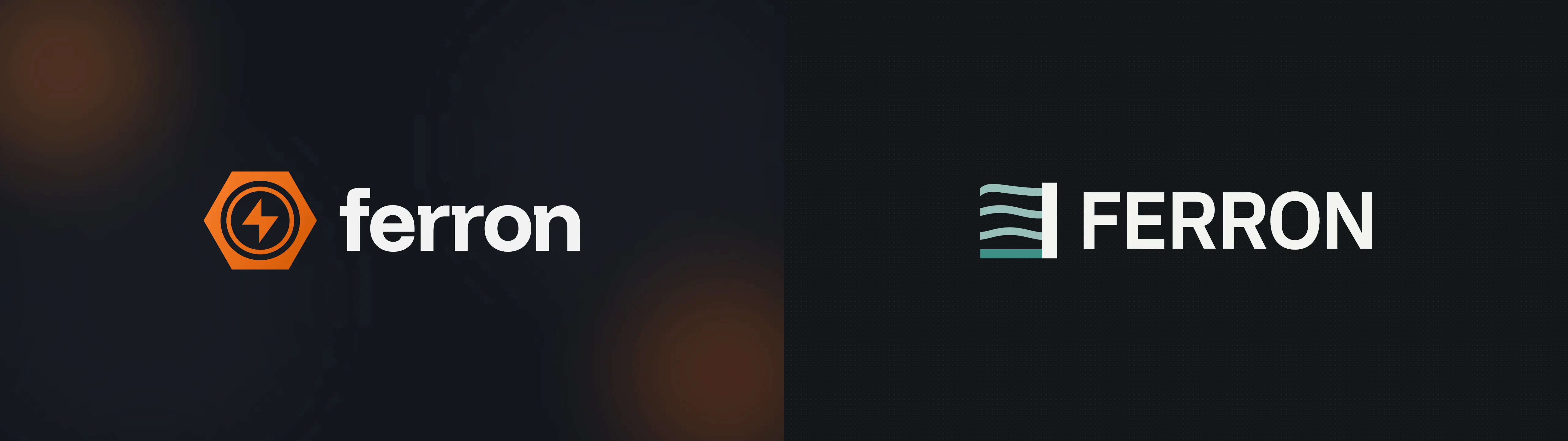
The old icon was a lightning bolt in a hexagon: a generic “fast” symbol that could belong to almost any dev tool. The new mark is built from Ferron’s own architecture instead — three uneven strokes, one per concurrent thread, settling into a single steady line as they reach the gate bar. It’s a small diagram of what thread-per-core scheduling actually does: busy, uneven work arriving, and one calm, consistent output. It also reads as an F.
Color
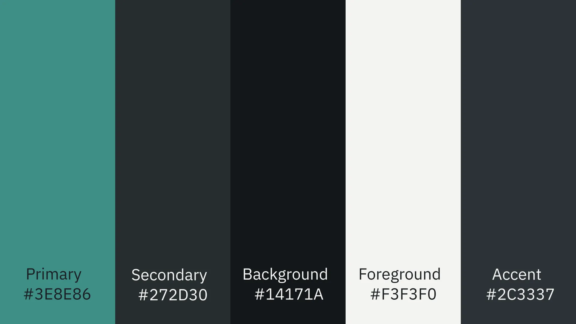
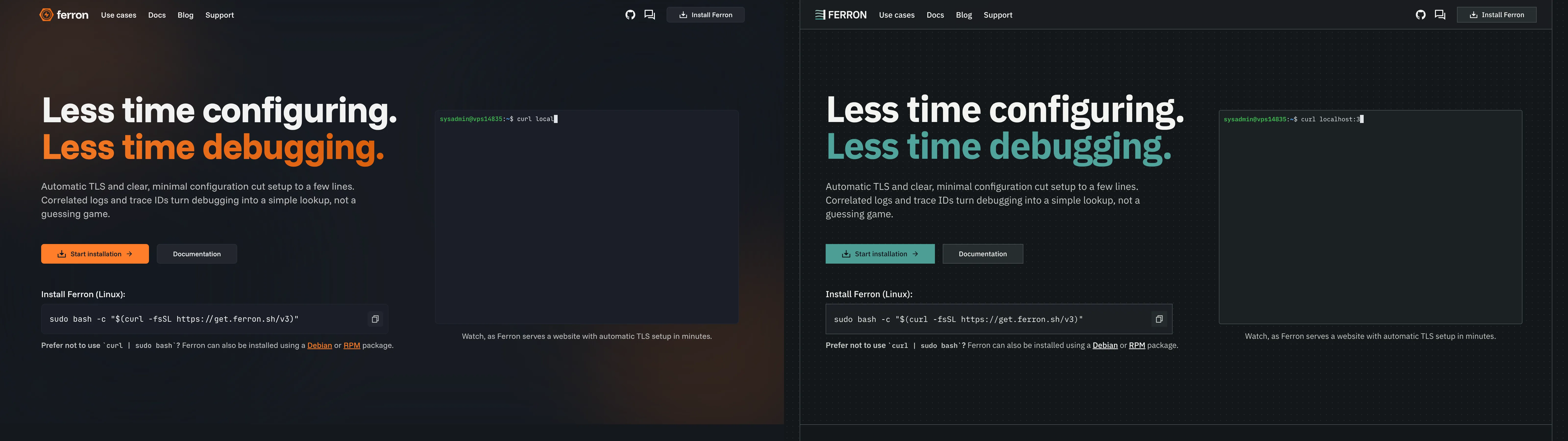
The old palette was black with a single loud orange accent — high-contrast, attention-seeking, the visual register of a launch banner. The new palette is graphite and fog, with one restrained teal accent (#3E8E86) that means the same thing everywhere it appears: a link, a focus ring, an active state. Color that’s spent everywhere stops meaning anything, which is a problem for a tool whose whole job is to make the one thing that’s actually wrong stand out in a log line.
Type
IBM Plex replaces the old rounded display sans. Plex Sans for reading, Plex Mono for anything that behaves like data: config keys, trace IDs, hex values, file paths. This isn’t a cosmetic swap — Ferron’s whole pitch is that the config file is readable enough to be the interface. The typography should look like it believes that, not just the docs.
Surfaces
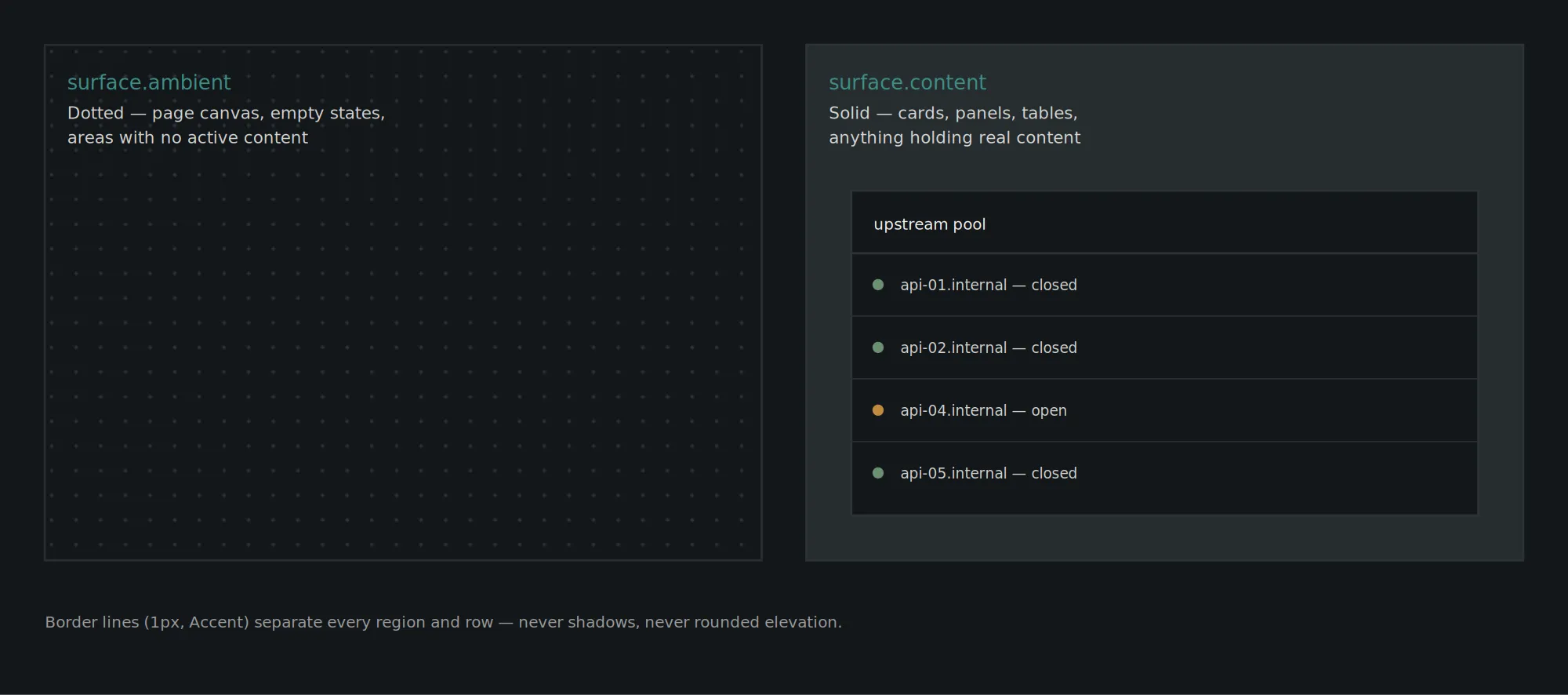
The old UI used solid dark panels throughout, with shadows to imply depth. The new system uses two backgrounds instead: a solid fill for anything holding real content — cards, tables, panels — and a dotted texture for ambient space that isn’t holding anything. Everything is separated by a 1px border line, never a shadow. Quieter, flatter, and closer to how a config file already separates its sections: with a rule, not a drop shadow.
What isn’t changing
Everything underneath the identity stays exactly as it was: plain-English configuration, no telemetry nobody asked for, decisions grounded in published benchmarks, vulnerabilities self-reported the same day they’re patched, and a landing page that only claims what’s actually shipped. The rebrand isn’t introducing new values. It’s the identity finally looking like the ones that were already there.
Where you’ll see it
The website goes first, timed to the 3.0 stable release. The GitHub org avatar and social previews follow shortly after.
Using the new assets
If you’re referencing Ferron somewhere — a comparison chart, a Compose badge, a conference slide — use the logo files as provided rather than recreating the mark from a screenshot. Full guidelines and source files are linked below.
- Logos - https://dl.ferron.sh/brand/logos-v3.zip
- Brand style guidelines - https://dl.ferron.sh/brand/brand-style-guidelines-v3.pdf
Calm under real traffic.